Statistical and Empirical Analyses of Haiti Cholera Post Mortems
*Corresponding Author(s):
Pietrafesa LJDepartment Of Marine, Earth And Atmospheric Sciences, Center For Marine & Wetland Studies, Coastal Carolina University, North Carolina State University, United States
Tel:+1 7049107047,
Email:len_pietrafesa@ncsu.edu
Abstract
A devastating 7.0-magnitude earthquake occurred on January 12, 2010 in Haiti (Figure 1) and killed over 316,000. In October 2010 Haitians were faced an outbreak of Cholera. Haiti recorded cases of cholera in its Centre and Artibonite Departments in October 2010. Following the earthquake and several months prior to the outbreak, spokespersons from the United States (USA) Centers for Disease Control and Prevention (CDC) said, “An outbreak of cholera was very unlikely”. The CDC’s assessment was reasonable, as Haiti had not experienced a cholera outbreak in over a century. However, several weeks after the earthquake Cholera rapidly spread, initially lamed by the CDC largely on “Haiti’s uniformly poor water and sanitation infrastructure”. In truth, even before the earthquake, the nation lacked adequate washing facilities. The lack of sanitation facilities was particularly grave; as of 2008, only 17 percent of the population had access to improved sanitation facilities. In the study reported on below, several mathematical methodologies, one empirical and one statistical, are employed to decompose the Cholera and other medical condition time series. From the analyses, predictive capabilities are created to forecast future outbreaks and related correlated medical conditions. The public health center data sets showed twenty additional medical conditions of patients tested, and many were found to be statistically correlated with cholera, with some not. As such, the implications of an at-risk population are quite challenging to the medical community.
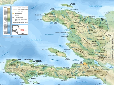
Figure 1: Topographical map of Haiti.
Keywords
Cholera; Haiti
INTRODUCTION
In October 2010, researchers at North Carolina State University (NCSU) were approached by representatives of Doctors without Borders (DWB) and asked if they could look at the Haiti Cholera data, from 7 Public Health Centers in Haiti (Figure 2) to determine its initial spread and to see if a prediction could be made regarding its possible future reappearance. The NCSU Team reported to the DWB that the outbreaks occurred at 6 of the 7 stations as delta function outbreaks, so it was as if the disease was carried to those locales. With these results, researchers at the CDC determined that the strain of cholera responsible for the outbreak was consistent with strains found in South Asia and may have been introduced into Haiti by peacekeepers from Nepal, part of the United Nations Stabilization Mission in Haiti. Furthermore, “patient zero” was identified by the DWB as a 28-year-old Haitian who was exposed to cholera while bathing in, and drinking from, a river near the peacekeepers’ camp. Ultimately, by the end of 2011, the outbreak had resulted in over 500,000 infections and 7,000 deaths. Cholera had also spread to the Dominican Republic; which, as of the end of 2011, had recorded over 21,000 cholera cases and 363 resulting deaths. Cholera rapidly spread, largely because of Haiti’s “uniformly poor water and sanitation infrastructure”.
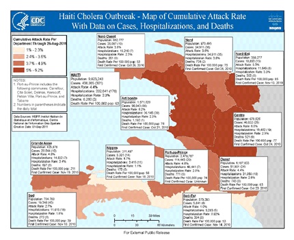 Figure 2: CDC Cholera outbreak map with case numbers.
Figure 2 was provided by the US CDC and concisely documents cholera data as a function of Public Health center locations. It is of note that in the figures to follow, the NCSU SAS Inc. software and the EEMD algorithm package [1], were utilized to create the data depictions. These software packages cannot be altered.
The Haiti cholera outbreak was determined by the CDC to be the worst epidemic in recent history and as of April 2013, had killed at least 7,000 Haitians and sickened a few hundred thousand more while spreading to neighboring countries including the Dominican Republic and Cuba. Since the outbreak began in October 2010, more than 6% of Haitians have had the disease. While there had been an apparent lull in cases in 2014, by August 2015, after the rainy season that year brought a spike in cases, more than 700,000 Haitians had become ill with cholera and the death toll had climbed to 9,000.
In figure 3, the NCSU time series of the data of the 7 time series of documented cases of Cholera in Haiti provided by the DWB to NCSU are presented. In figure 4 the official Cholera cases plots are provided to show that the DWB and NCSU statistical data sets are identical.
 Figure 3
Figure 4: The DWB time series of Haiti Cholera time series.
As the cholera and other medical condition data sets required additional medical and mathematical expertise, researchers at Coastal Carolina University (CCU) contributed to this study.
DATA DECOMPOSITION
The Hilbert Transform (HT), the Empirical Mode (EMD) and Ensemble Empirical Mode Decomposition (EEMD)
The Hilbert Transform [2], has been applied to data time series that are both non-periodic and non-linear. The Hilbert Transform (HT) is thus more versatile than the Fourier Transform (FT), which can only transform periodic and linear data sets [3,4]. The Haiti Cholera data are both non-periodic and non-linear. Due to the HT being a global domain integral, the instantaneous amplitude and instantaneous frequency obtained using the HT is neither temporally local nor instantaneous, the direct quadrature algorithm is implemented to obtain the instantaneous amplitude and instantaneous frequency. In the process of employing the HT, one obtains a series of frequency and amplitude modulated internal modes of variability buried within a time series, which Huang et al. [3], deemed the Empirical Mode Decomposition (EMD). To eliminate spurious noise within the EMD Wu and Huang [5-7], created the Ensemble EMD, the EEMD.
In the EMMD, data time series x(t) are decomposed in terms of “Intrinsic Mode Functions” (IMFs), cj, i.e.
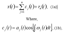 and rn is the residual of the data x(t), after n Intrinsic Mode Functions (IMFs) are extracted from the instantaneous frequency, omega from high frequency to low frequency intrinsic modes from j=1 to the finite number “j=n”, determined via the “sifting” process and which constitute the limits of the integral (i.e. 1 to finite number “j=n”). Here “instantaneous frequency” is defined in context, and the integral can be considered as the local mean for IMF cn. Clearly, The IMFs expressed in Equation (1b) are simple oscillatory functions with relatively slowly varying and non-negative amplitude and relatively fast changing and non-negative frequency at any temporal point.
In practice, the EEMD is implemented through a sifting process that uses only local extrema. From any data set, x(t)=rj-1, say, the procedure is as follows: 1) Identify all the local extrema (The combination of both maxima and minima) and connect all these local maxima (Minima) with a cubic spline as the upper (Lower) envelope; 2) Obtain the first component h by taking the difference between the data and the local mean of the two envelopes; and 3) Treat h as the data and repeat steps 1 and 2 as many times as is required until the envelopes are symmetric about zero within a certain tolerance. The final h is designated as cj. A complete sifting process stops when the residue, rn, becomes a monotonic function or a function only containing one internal extremum from which no more IMFs can be extracted. In this method, multiple noise realizations, such as 100, are added to one time series of observations to mimic a scenario of multiple realizations from which an ensemble average approach for corresponding IMFs can be used to extract scale-consistent signals. The major steps of the EEMD method are as the following:
- Add a white noise time series to the targeted data.
- Decompose the data with added white noise into IMFs.
- Repeat step 1 and step 2 again and again, but with different white noise series each time.
- Obtain the (Ensemble) means of corresponding IMFs of the decompositions as the final result.
After a time series is decomposed into IMFs, natural amplitude-frequency modulated oscillatory functions, various methods can be applied to obtain instantaneous frequencies for each IMF that lead to time-frequency-energy representation of data.
In figures 5a-h, the EEMD IMF’s are shown for all of the Public Health Locales in Haiti, along with the overall total.
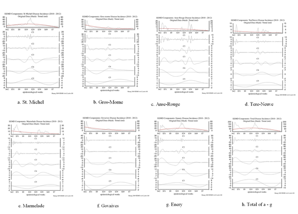
Figure 5: The IMF decompositions of the 7 data sets of Cholera cases all display 6 modes of higher to lower frequency modes. Mode 6, the red line in the top panels, is the trends.
In table 1, the IMFs as a function of station location are provided. The IMFs are all temporally consistent with each other, showing that the cases of Cholera are consistent across Haiti.
|
Station=> Mode # Is Down |
St Michel |
Gros-morne |
Marmelade |
Ennery |
Govaives |
Terr Neuve |
Anse-Rouge |
|
Mode 6: The “Trend”. This is also the Base to which all other modes Either add to Or subtract From, for a specific Epi-Week. |
Starts at~5 on S42, then rises to a peak at ~20 on S27 and then drops to 0, on S7, S8 |
Starts at~31 on S42, then goes down to 0, on S7, S8 |
Starts at~12 on S42, then drops to~3 on S15 |
Starts at~2 on S42 then rises to a peak of ~ 20 on S27, then falls to 0 on S13 |
Starts at~19 on S42, then drops to 0 on S15 |
Starts at~3 On S42, Then drops to 0 on S15 |
Starts at 6 on S42, then drops to 1 on S15 |
|
Mode 5: Period of~71 to 74 Weeks; an Oscillation |
Has a record-length period with a+7 or-4 cases amplitude; starts positive then goes negative |
Has a record-length period with a+3 or -4 cases amplitude; starts negative then goes positive |
Has a record-length period with a+1 or -1 cases amplitude; starts negative then goes positive |
Has a record length period with a+3 or -3 cases amplitude; starts positive then goes negative |
Has a record- Length period with a+2 or -2 cases amplitude; starts negative then goes positive |
Has a record- length period with a+1 or -1 cases amplitude; starts negative then goes positive |
Has a record length period with a +1 or -1 cases amplitude; starts negative then goes positive |
|
Mode 4: Period Of ~39 to 50 weeks |
Amplitude of -10 to +20 cases |
Amplitude of -8 to +9 cases |
Amplitude of -7 to +7 cases |
Amplitude of -7 to +14 cases |
Amplitude of -6 to +6 cases |
Amplitude of -1 to +1 cases |
Amplitude of -4 to +4 cases |
|
Mode 3: Period of 15-20 weeks |
Amplitude of -15 to +15 cases |
Amplitude of -5 to +7 cases |
Amplitude of -10 to +10 cases |
Amplitude of -20 to +25 cases |
Amplitude of -5 to +9 cases |
Amplitude of -2 to +2 cases |
Amplitude of -4 to +4 cases |
|
Mode 2: Period of ~7-8 weeks |
Amplitude of -15 to +15 cases; mostly from S19-S29 |
Amplitude of -10 to +10 cases mostly S42-S50 |
Amplitude of -3 to +7 cases |
Amplitude of -15 to +15 cases |
Amplitude of -10 to +10 cases |
Amplitude of -3 to +4 cases |
Amplitude of -5 to +5 cases |
|
Mode 1: Period of ~3 weeks |
Amplitude of -15 to +15 cases; all be for S39 |
Amplitude of -10 to +17 cases; all before S50 |
Amplitude of -7 to +7 cases |
Amplitude of -10 to +15 cases |
Amplitude of -10 to +30 cases; all before S50 |
Amplitude of -3 to +6 cases |
Amplitude of -10 to +10 cases |
|
Time Series dominated by: |
Modes 1,2,3,4,5 all important |
Mode 1 before S50, then Modes 2,3,4 dominate |
Modes 1,2,3,4,5 all important |
Modes 1,2,3,4 dominate |
Mode 1 before S50, then Modes 2,3,4 dominate |
Modes 1,2,3,4 dominate |
Modes 1,2,3,4,5 all important |
|
Summation Plot |
Modes 1, 2 only important from S42- S52 at disease onset |
Mode 3 important up to S35 |
Mode 4 Important up to S39 |
Mode 5 important throughout |
Trend= Mode 6 30 to 0 by S39 |
|
|
Table 1: Summary Matrix of EEMD IMF Plots.
From a one-to-one comparison of the IMFs presented in figure 5, we find visually that for IMF C5 (Inter-Annual, about 1.5 years, variability), C4 (~ Annual or between 40-50 week variability), C3 (~ seasonal or 3-4 month variability), C2 (~ 2 months or 7-8 weeks) and C1 (~ 3 weeks): a) C5 shows that Cazale, Ennery and St. Michel are In-Phase; b) C5 shows that Anse Rouge, Govaives, Gros-Morne, Terr Neuve and Marmelade are In-Phase; c) C5 that Cazale-Ennery-St. Michel are Out-of-Phase with Anse Rouge, Govaides, Grosmorn, Terrneuve and Marmelade; d) C4 that Cazale, Ennery and St. Michel are In-Phase; e) C4 that Govaides and Gros-Morne are In-Phase; f) C4 that Anse-Rouge, Marmalade and Terr Neuve are In-Phase; g) C3 that Cazale, Ennery, Govades, Gros-Morne and St. Michel are In- Phase; h) C3 that Anse-Rouge and Marmalade are In-Phase; i) That TerrNeuve had very few cases in the C3 frequency mode; j) C2 that Anse Rouge, Ennery, Gros-morne, Govades and St. Michel are In-Phase; k) C2 that Cazale, Marmalade and Terr Neuve go In-Phase and Out-of-Phase with each other and the other stations as well; and l) C1 is very high frequency with mixed results.
Unfortunately, this visual correlation is not highly conclusive. Therefore, attempting to go beyond “visual correlations”, we take a different approach, mixing our empirically derived results with a statistical analysis. This approach has been reported in the literature.
Statistical analyses of the empirically derived IMFs resulting in highly correlated modes, well correlated modes and un-correlated modes
We believe that the above EEMD IMF results can be compared directly using the Statistical Correlation Matrix approach. We now present statistical EEMD IMF correlations between IMF Modes on a Mode by Mode basis. To our knowledge this type of analysis has never previously been done or certainly has not been reported upon in the literature. Tables 2-7 display those cross-correlations. We will employ Pearson Correlation Coefficients [8], (Sample N = 78), where Probability > |r| under H0: Rho=0.
If |r| < 0.22 this is considered to be not statistically significant,
If |r| >/= 0.23 this is considered to be statistically significant,
If |r| > 0.363 this is considered to be very statistically significant and
If |r| >/= 0.364 this is considered to be extremely statistically significant.
|
Mode 1 |
Anse_rouge |
Ennery |
Govaives |
Gros_morn |
Marmelade |
Stmichel |
Terrneuve |
|
Anse_rouge |
1.0000 |
0.1903 |
-0.0438 |
-0.0711 |
0.0924 |
0.0092 |
0.3251 |
|
Ennery |
0.1903 |
1.0000 |
-0.1430 |
-0.2283 |
0.3725 |
0.2761 |
-0.1821 |
|
Govaives |
-0.0438 |
-0.1430 |
1.0000 |
0.9483 |
-0.5451 |
0.1990 |
-0.4604 |
|
Gros_morne |
-0.0711 |
-0.2283 |
0.9483 |
1.0000 |
-0.6060 |
0.0938 |
-0.5087 |
|
Marmelade |
0.0924 |
0.3725 |
-0.5451 |
-0.6060 |
1.0000 |
0.0195 |
0.1929 |
|
Stmichel |
0.0092 |
0.2761 |
0.1990 |
0.0938 |
0.0195 |
1.0000 |
-0.0420 |
|
Terrneuv |
0.3251 |
-0.1821 |
-0.4604 |
-0.5087 |
0.1929 |
-0.0420 |
1.0000 |
Table 2: Mode1 is the mode that represents the highest frequency of variability.
Mode1 is the mode that represents the highest frequency of variability, ~ 2-3 weeks, of the time series at each station. For Mode 1, Govaives has the highest positive correlation with, followed with a second strong negative correlation (-0.6060) between stations Gros Morne, Marmalade and Terreuve. The above correlations of the first EEMD mode indicates that Govaives, Gros Morne, Marmalade and Terrnruve are most strongly connected, while station St Michel is only statistically correlated with station Ennery and is independent of other stations. Anse rouge has a very statistically significant correlation with Terrneuve, but has no significant correlation with other stations.
Although Ennery, Marmelade and St Michel are connected, their correlations are not extremely significant.
|
Mode 2 |
Anse_rouge |
Ennery |
Govaives |
Gros_morn |
Marmelade |
Stmichel |
Terrneuve |
|
Anse_rouge |
1.0000 |
0.7238 |
0.3480 |
0.3573 |
0.1710 |
0.3522 |
0.7048 |
|
Ennery |
0.7238 |
1.0000 |
0.1155 |
0.1290 |
0.4661 |
0.3609 |
0.5394 |
|
Govaives |
0.3480 |
0.1155 |
1.0000 |
0.9219 |
-0.2109 |
0.2964 |
0.4038 |
|
Gros_morne |
0.3573 |
0.1290 |
0.9219 |
1.0000 |
-0.2928 |
0.3617 |
0.2698 |
|
Marmelade |
0.1710 |
0.4661 |
-0.2109 |
-0.2928 |
1.0000 |
-0.0433 |
0.2402 |
|
Stmichel |
0.3522 |
0.3609 |
0.2964 |
0.3617 |
-0.0433 |
1.0000 |
-0.0548 |
|
Terrneuv |
0.7048 |
0.5394 |
0.4038 |
0.2698 |
0.2402 |
-0.0548 |
1.0000 |
Table 3: Mode 2 depicts about 7 - 8 weeks in variability.
Mode 2 depicts about 7 - 8 weeks in variability. Govaives has a very strong correlation with Gros Morne and to a less or degree, Terrnruve, however it has no significant correlation with Marmalade. Govaives is significantly correlated to Anse-rouge and St Michel. Anse rouge and Ennery are also significantly correlated. Terrneuve is significantly correlated with all other stations except for St Michel, which itself is well correlated with all stations but Marmalade and Terreneuve.
|
Mode 3 |
Anse_rouge |
Ennery |
Govaives |
Gros_morn |
Marmelade |
Stmichel |
Terrneuve |
|
Anse_rouge |
1.0000 |
0.1573 |
0.0071 |
-0.2266 |
0.6207 |
-0.1480 |
0.3454 |
|
Ennery |
0.1573 |
1.0000 |
0.7859 |
0.4387 |
0.3791 |
0.5267 |
0.3329 |
|
Govaives |
0.0071 |
0.7859 |
1.0000 |
0.6888 |
0.1683 |
0.4503 |
0.4117 |
|
Gros_morne |
-0.2266 |
0.4387 |
0.6888 |
1.0000 |
-0.2876 |
0.4666 |
0.5137 |
|
Marmelade |
0.6207 |
0.3791 |
0.1683 |
-0.2876 |
1.0000 |
-0.1781 |
0.3223 |
|
Stmichel |
-0.1480 |
0.5267 |
0.4503 |
0.4666 |
-0.1781 |
1.0000 |
0.1110 |
|
Terrneuv |
0.3454 |
0.3329 |
0.4117 |
0.5137 |
0.3223 |
0.1110 |
1.0000 |
Table 4: Mode 3 shows 15-20 weeks in variability.
Mode 3 shows 15-20 weeks in variability. The strongest correlation occurs between Govaives and Ennery and Gros Morne. Ennery and Govaives are significantly correlated to all other stations, except to Anse rouge, which is correlated with Marmalade and Terrneuve.
|
Mode 4 |
Anse_rouge |
Ennery |
Govaives |
Gros_morn |
Marmelade |
Stmichel |
Terrneuve |
|
Anse_rouge |
1.0000 |
-0.2983 |
0.4917 |
0.5053 |
0.8123 |
-0.2750 |
0.7139 |
|
Ennery |
-0.2983 |
1.0000 |
0.4666 |
0.4066 |
-0.4701 |
0.9702 |
0.3231 |
|
Govaives |
0.4917 |
0.4666 |
1.0000 |
0.9760 |
0.0797 |
0.5591 |
0.5988 |
|
Gros_morne |
0.5053 |
0.4066 |
0.9760 |
1.0000 |
0.0578 |
0.4713 |
0.6092 |
|
Marmelade |
0.8123 |
-0.4701 |
0.0797 |
0.0578 |
1.0000 |
-0.4788 |
0.4295 |
|
Stmichel |
-0.2750 |
0.9702 |
0.5591 |
0.4713 |
-0.4788 |
1.0000 |
0.2739 |
|
Terrneuv |
0.7139 |
0.3231 |
0.5988 |
0.6092 |
0.4295 |
0.2739 |
1.0000 |
Table 5: Mode 4 shows 40-50 weeks of variability.
Mode 4 shows 40-50 weeks of variability. Ennery, Gros-Morne and Terrneuve are all significantly correlated to other stations. The highest correlation is between Gros-Morne and Govaives (0.9760) with the second highest between Ennery and St Michel. Notably, the overall strong positive correlation between stations implies that Mode 4 of the time series in those stations is in-phase and has similar variation patterns.
|
Mode 5 |
Anse_rouge |
Ennery |
Govaives |
Gros_morn |
Marmelade |
Stmichel |
Terrneuve |
|
Anse_rouge |
1.0000 |
-0.5104 |
0.8939 |
0.9375 |
0.6336 |
-0.1807 |
0.9444 |
|
Ennery |
-0.5104 |
1.0000 |
-0.7878 |
-0.7238 |
-0.9681 |
0.9150 |
-0.7318 |
|
Govaives |
0.8939 |
-0.7878 |
1.0000 |
0.9908 |
0.8866 |
-0.4973 |
0.9541 |
|
Gros_morne |
0.9375 |
-0.7238 |
0.9908 |
1.0000 |
0.8253 |
-0.4034 |
0.9762 |
|
Marmelade |
0.6336 |
-0.9681 |
0.8866 |
0.8253 |
1.0000 |
-0.8314 |
0.8017 |
|
Stmichel |
-0.1807 |
0.9150 |
-0.4973 |
-0.4034 |
-0.8314 |
1.0000 |
-0.4239 |
|
Terrneuv |
0.9444 |
-0.7318 |
0.9541 |
0.9762 |
0.8017 |
-0.4239 |
1.0000 |
Table 6: Mode 5 displays 1.5 year variability and all stations.
Mode 5 displays 1.5 year variability and all stations, except for Anse rouge and Terrneuve, are strongly correlated. The highest correlation occurs between Gros Morne and Govaives, second highest correlation between Marmalade and Ennery. We note that, excepting for St. Michel and Anse rouge all stations are either strongly positively or negatively correlated over the year and a half time scale.
|
Mode 6 |
Anse_rouge |
Ennery |
Govaives |
Gros_morn |
Marmelade |
Stmichel |
Terrneuve |
|
Anse_rouge |
1.0000 |
0.4259 |
0.8390 |
0.7979 |
0.8877 |
0.6721 |
0.8925 |
|
Ennery |
0.4259 |
1.0000 |
-0.1349 |
-0.2055 |
-0.0385 |
0.9562 |
-0.0279 |
|
Govaives |
0.8390 |
-0.1349 |
1.0000 |
0.9974 |
0.9953 |
0.1610 |
0.9942 |
|
Gros_morne |
0.7979 |
-0.2055 |
0.9974 |
1.0000 |
0.9858 |
0.0899 |
0.9840 |
|
Marmelade |
0.8877 |
-0.0385 |
0.9953 |
0.9858 |
1.0000 |
0.2556 |
0.9999 |
|
Stmichel |
0.6721 |
0.9562 |
0.1610 |
0.0899 |
0.2556 |
1.0000 |
0.2658 |
|
Terrneuv |
0.8925 |
-0.0279 |
0.9942 |
0.9840 |
0.9999 |
0.2658 |
1.0000 |
Table 7: Mode 6 represents the long-term trends of the various time series.
Mode 6 represents the long-term trends of the various time series. All trends, if well correlated, are positive, meaning that time series varied either in an ascending or decreasing sense as time progressed. The maximum correlation coefficient is between Govaives and Gros-Morne, with the second largest between Govaives and Marmalade. Anse-Rouge displays an extremely significant correlation with all other stations, while Ennery is only significantly connected to Anse-Rouge and St Michel, and is independent of the other stations.
Statistical analyses of the original 7 data sets and the development of “patterns”
To begin the Statistical analyses of the original 7 stations, we plot the Data on the original scale with the conventions that circles are data, and lines are smoothing splines running through the data. The results are shown in figure 6.
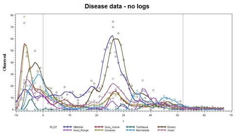 Figure 6: Observations (from figure 2) indicate that some coherency is apparent in a few of the series.
We then regressed the data on 7 sine-cosine pairs and via employing a linear trend, we seem to capture the patterns nicely, as shown in figure 7.
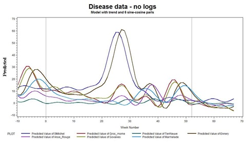 Figure 7: Disease data.
From figure 7, we see that when there are high peaks in the time series, we see much more variability than when the levels are low, a typical symptom of the statistical need to log transform the data.
Here in figures 8a & b, are the same graphs as in figure 7, shown on the log scale: Y→log(Y+1). Note the more uniform variations throughout the time sequences, as well as the tighter coherency toward the end of Year 2 and into Year 3.
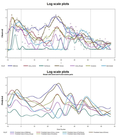 Figures 8: a) Data on a Log scale; b) Without the actual data points.
So, from figures 6-8, the diagnostic statistical analyses and the sine-cosine pairs with the linear trend produced remarkably good agreement. This suggests that a reasonable prognostic capability has been established, and that the future can be predicted from the past. Thus the time series could be run out for the next year in a predictive mode. However, before attempting to do so, we should test whether or not the strength of the trends are significant.
We can test, on a case by case, whether the trends are significant. A “p-value” (Pr>F) that is less than 0.05 indicates significance:
Test trend results
|
Dependent Variable |
Mean |
||||
|
Source |
DF |
Square |
F Value |
Pr>F |
|
|
St Michel |
Numerator |
1 |
25.08248 |
363.71 |
<.0001 |
|
Gros-morne |
Numerator |
1 64 |
21.82081 |
123.62 |
<.0001 |
|
0.17651 |
|||||
|
Terr Neuve |
Numerator |
1 |
0.05312 |
0.18 |
0.6755 |
|
0.30041 |
|||||
|
Ennery |
Numerator |
1 |
14.76168 |
35.46 |
<.0001 |
|
0.41628 |
|||||
|
Anse Rouge |
Numerator |
1 |
3.94366 |
5.65 |
0.0205 |
|
0.6986 |
|||||
|
Govaives |
Numerator |
1 |
15.70193 |
52.37 |
<.0001 |
|
0.29983 |
|||||
|
Marmelade |
Numerator |
1 |
2.83516 |
6.27 |
0.0148 |
|
0.45227 |
|||||
We can test case by case for seasonality as measured by the test for the seven sine-cosine pairs (fundamental period 52 plus 5 harmonics) used in the model. A p-value (Pr>F) that is less than 0.05 indicates significance:
Test spectral results
|
Dependent Variable |
Mean |
||||
|
Source |
DF |
Square |
F Value |
Pr>F |
|
|
StMichel |
Numerator |
12 |
2.65954 |
38.56 |
<.0001 |
|
Gros morne |
Numerator |
12 |
1.65998 |
9.4 |
<.0001 |
|
0.17651 |
|||||
|
Terr Neuve |
Numerator |
12 |
0.98276 |
3.27 |
0.001 |
|
0.30041 |
|||||
|
Ennery |
Numerator |
12 |
6.49655 |
15.61 |
<.0001 |
|
0.41628 |
|||||
|
Anse Rouge |
Numerator |
12 |
2.20902 |
3.16 |
0.0014 |
|
0.6986 |
|||||
|
Govaives |
Numerator |
12 |
1.25012 |
4.17 |
<.0001 |
|
0.29983 |
|||||
|
Marmelade |
Numerator |
12 |
4.71071 |
10.42 |
<.0001 |
|
0.45227 |
|||||
All series have a trend, which is not to say they have the same slope and all have seasonal pattern, which is not to say they are coherent, but that they just share the same frequencies. Just a plain correlation between pairs of series is an indication of coherency that does not involve models for the data. We have noted those greater than 0.50.
Pearson Correlation Coefficients, N = 78, Prob > |r| under H0: Rho=0
|
StMichel |
Gros morne |
Terr Neuve |
Ennery |
Anse Rouge |
Govaives |
Marmelade |
|
|
StMichel |
1.00000 |
0.54773 |
-0.03195 |
0.69814 |
0.16504 |
0.60621 |
-0.11285 |
|
<.0001 |
0.7812 |
<.0001 |
0.1487 |
<.0001 |
0.3252 |
||
|
Gros morne |
0.54773 |
1.00000 |
0.20647 |
0.42553 |
0.40479 |
0.82625 |
0.21543 |
|
<.0001 |
0.0697 |
0.0001 |
0.0002 |
<.0001 |
0.0582 |
||
|
Terr Neuve |
-0.03195 |
0.20647 |
1.00000 |
0.22192 |
0.59794 |
0.18275 |
0.24927 |
|
0.7812 |
0.0697 |
0.0508 |
<.0001 |
0.1093 |
0.0278 |
||
|
Ennery |
0.69814 |
0.42553 |
0.22192 |
1.00000 |
0.49289 |
0.61795 |
0.34792 |
|
<.0001 |
0.0001 |
0.0508 |
<.0001 |
<.0001 |
0.0018 |
||
|
Anse Rouge |
0.16504 |
0.40479 |
0.59794 |
0.49289 |
1.00000 |
0.47641 |
0.52272 |
|
0.1487 |
0.0002 |
<.0001 |
<.0001 |
<.0001 |
<.0001 |
||
|
Govaives |
0.60621 |
0.82625 |
0.18275 |
0.61795 |
0.47641 |
1.00000 |
0.32042 |
|
<.0001 |
<.0001 |
0.1093 |
<.0001 |
<.0001 |
0.0042 |
||
|
Marmelade |
-0.11285 |
0.21543 |
0.24927 |
0.34792 |
0.52272 |
0.32042 |
1.00000 |
|
0.3252 |
0.0582 |
0.0278 |
0.0018 |
<.0001 |
0.0042 |
We can then visualize the above correlations in a “scatter plot matrix” (Figure 9) in which a grid of bivariate plots is presented. For a graph in one of the cells, the label for the vertical axis is the one in that same row of cells and the label for the horizontal axis is the one in that column of cells. The labels run down the diagonal of the matrix. The Scatter plot overlays on the data to which the function presented above was fitted.
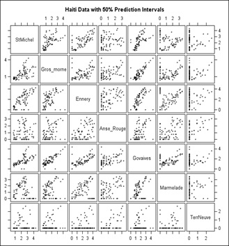 Figure 9: Scatter-Plot Matrix of the Cholera data.
Figure 9 is a straightforward scatter plot while the scatter plot shown in figure 10 has 50% confidence ellipses drawn in using a multivariate normal assumption which would be incorrect when there are a lot of 0’s as in Terre Neuve (Right column and bottom row, which is why we moved it to last). Still, it does enhance the visuals somewhat for example Govaives and Ennery show a narrow ellipse tilted at about 45 degrees indicating a high degree of correlation; as do other stations with other stations.
In figure 10, we present the Scatter Plot Matrix of the Cholera data but with 50% Confidence Ellipses drawn as well. Basically, the higher the positive correlation between stations, the closer the major axis of the Ellipses lie to a 45 degree line, or an ellipse particularly one that is elongated, from lower left to upper right, in each of the Scatter Plot Squares; such as St. Michel with Ennery and Gros-Morne.
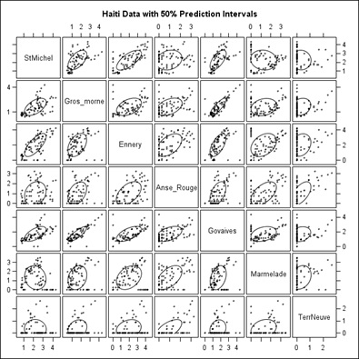 Figure 10: Same as figure 9 with 50% Confidence Ellipses.
Next, suppose we compute, on the log scale, which seems appropriate from the graphs previously submitted, the mean of the 7 sites for each week then regress on the 7 sine-cosine pairs (fundamental and 5 harmonics) and time t to get the linear downward trend. This is presented in figure 11. Here are the predicted values and 95% prediction limits for individual weekly means. We see a peak at t=-6 repeating 52 weeks later at week t=46. So, we have seen it at week 46 of 2 years. Between these markers is a larger peak at t=27. There is no week 27 value in either of the other years. Note that t=1 is the first week of the middle year with negative t’s for the previous year.
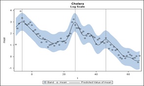 Figure 11: A Prediction of the cumulative Cholera data set.
Next we convert back to the actual number scale. In figure 12, that plot is shown.
 Figure 12: The conversion form the log scale (Figure 11) to the actual number scale.
We note that in figure 12, a statistically significant downward trend is found. The trend shows about a 3% drop in rate per week (-0.02926). From the statistical perspective, claims of significant seasonality based on less than 2 years of data is on very shaky ground. If forced to do so, it would appear that there is a bimodal pattern peaking around weeks 27 and 46 of the year but notice that the only case where we saw more than one instance of the peak was the leftmost and rightmost lines (at week 46). The week 27 peak is based on only one of the observed years. Note that on the original scale our effects are multiplicative so when the level is lower, like in that second instance, the multiplicative increase will produce a less impressive peak than that at the higher level. A 5% increase when the rate is 100 cases per million people is just 5 people whereas it is 50 people when the rate is 1000 cases per million people. That is why the second instance is a lower peak than the first. It is a percentage increase from a lower point on that linear trend.
By taking a mean over the 7 cases, we are ignoring any phase alignment issues but we think there was reasonable coherency in the previous graphs. Also, there was no accounting for autocorrelation when computing the prediction bands or t tests below. Autocorrelation could render bands a little wider and tests less significant (more uncertainty). On the positive side we are explaining about 90% of the variation on the log scale with this model as the R2 below shows.
Analysis of Variance
|
Analysis of Variance |
|||||
|
Source |
DF |
Sum of Squares |
Mean Square |
F Value |
Pr > F |
|
Model |
13 |
66.78874 |
5.1376 |
39.62 |
<.0001 |
|
Error |
64 |
8.29866 |
0.12967 |
||
|
Corrected Total |
77 |
75.08739 |
|
Root MSE |
0.36009 |
R-Square |
0.8895 |
|
Dependent Mean |
1.46301 |
Adj R-Sq |
0.867 |
|
Coeff Var |
24.61306 |
|
|
Parameter Estimates |
|||||
|
Variable |
DF |
Parameter Estimate |
Standard Error |
t Value |
Pr > |t| |
Type I SS |
|
Intercept |
1 |
2.39648 |
0.06925 |
34.6 |
<.0001 |
166.95182 |
|
t |
1 |
-0.02926 |
0.0019 |
-15.38 |
<.0001 |
40.94076 |
|
s1 |
1 |
-0.58774 |
0.0608 |
-9.67 |
<.0001 |
14.17099 |
|
c1 |
1 |
-0.36806 |
0.06112 |
-6.02 |
<.0001 |
3.41315 |
|
s2 |
1 |
0.03822 |
0.06235 |
0.61 |
0.5421 |
0.01769 |
|
c2 |
1 |
0.3796 |
0.06148 |
6.17 |
<.0001 |
4.42778 |
|
s3 |
1 |
-0.15804 |
0.06097 |
-2.59 |
0.0118 |
1.1067 |
|
c3 |
1 |
-0.12265 |
0.06087 |
-2.01 |
0.0481 |
0.51172 |
|
s4 |
1 |
-0.07161 |
0.06063 |
-1.18 |
0.242 |
0.17631 |
|
c4 |
1 |
0.10346 |
0.06141 |
1.68 |
0.0969 |
0.16741 |
|
s5 |
1 |
-0.03663 |
0.06102 |
-0.6 |
0.5505 |
0.02031 |
|
c5 |
1 |
-0.19436 |
0.06051 |
-3.21 |
0.0021 |
0.98003 |
|
s6 |
1 |
0.10149 |
0.05897 |
1.72 |
0.09 |
0.37707 |
|
c6 |
1 |
0.11512 |
0.05991 |
1.92 |
0.0591 |
0.4788 |
There does seem to be autocorrelation around 0.30 in the residuals which we can take into account. There is no change in the overall conclusions. The graphs are jagged as the predictions are now one step ahead predictions using the previous residual and autocorrelation to adjust the forecast:
Statistically speaking, the patterns are intriguing, but we have so few years to go on that we are hesitant to think our analyses pinned down the pattern. We do get a nice fit, explaining 90% of the variation in the historic weekly mean incidence with our model. The question is whether that will hold up in future years. Unfortunately, we have not seen enough years to feel confident about repetitive behavior. The rate does seem to be trending downward in reports from Haiti.
Cazale data set and the EEMD IMF decomposition
The Cazale data set was provided well into the study of the original data sets. We cannot include them into what has already been done above. However, the great value of the Cazale data is that it is daily confirmed cases. This is in contrast to the previous data sets presented above which were compiled over a week’s period of time for each locale. Cazale’s location is shown in figure 13. 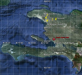 Figure 13: Cazale’s location in Haiti.
The EEMD IMF decomposition of the Cazale daily time series (Figure 14a) indicates that the increase in the frequency of sampling has added three higher frequency IMFs to the suite of modes. This offers us the opportunity of doing weekly averages over the data set, which can then be compared and contrasted with the Original Time Series that we presented above. We present the weekly averaged time series decomposition in the figure 14b. Sure enough, the three very high frequency modes disappear.
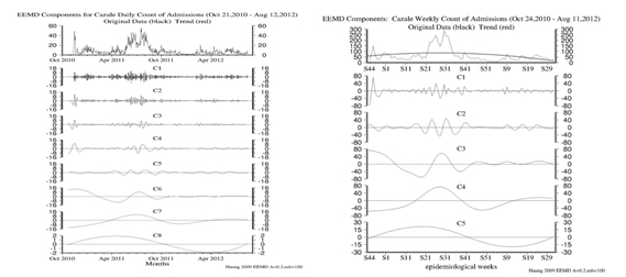 Figure 14: a) IMF Modes 1-9 of the daily Cazale time series of Cholera cases; b) IMF modes 1-6 of the weekly averaged Cazale time series.
Modes 1,2,3 in figure 14a above indicate 1-2, 2-3 and 3-5 day variability in the data. Modes 4 through 8 in figure 14a and Modes 1 through 5 in figure 14b can be compared directly and are the same modes of internal variability in the data.
Stacked EEMD intrinsic mode functions of All data sets including original 7 plus Cazale (CZ) in search of phase relationships
Below, in table 8, we present all of the cholera data IMF modes compared against each other, figures 5 a-h, a virtual stacking of the EEMD IMF modes. We assess the phase relationships in each in an effort to determine the temporal and spatial propagation of the outbreak of cholera. We note that this is an experimental product and has never been previously tried to our knowledge. We see which Station leads another Station by Mode and by sequence; so 1 is 1st, 2 is 2nd , and so on, 3, 4, 5, 6, 7, finally the last station to be hit, 8. We note that some sets of stations are hit at nearly the same time so they receive multiple #s.
|
Modes (Down) |
Stations => |
CZ |
A-R |
EM |
GV |
G-M |
MA |
S-M |
T-N |
|
1 |
|
8 |
7 |
1 - 4 |
5 - 6 |
5 - 6 |
1 - 4 |
1 - 4 |
1 - 4 |
|
2 |
|
4 - 5 |
4 - 5 |
6 - 7 |
2 - 3 |
1 |
8 |
2 - 3 |
6 - 7 |
|
3 |
|
1 - 2 |
8 |
5 - 6 |
3 - 4 |
3 - 4 |
7 |
1 - 2 |
5 - 6 |
|
4 |
|
8 |
1 - 3 |
7 |
1 - 3 |
1 - 3 |
6 |
4 - 5 |
4 - 5 |
|
5 |
|
1 |
4 |
2 |
5 - 6 |
5 - 6 |
8 |
3 |
7 |
|
Total Time Series |
|
8 |
4, 5, 6 |
4, 5, 6 |
3 |
2 |
4, 5, 6 |
7 |
1 |
Table 8: Total time series.
The conclusion reached from table 8 is that no definitively clear pattern of the temporal-spatial spread of the cholera epidemic is evident over the various time scales of variability (weekly (Mode 1) to bi-weekly (Mode 2) to monthly (Mode 3) to seasonally (Mode 4) to annually) (Mode 5) from station to station.
The Total Time Series (TTS) suggests that the spatial movement was from TerrNeuve to Gros-morne to Govaives to Ennery/Marmelade/Anse-Rouge to St Michele and then to Cazale. However, this analysis was not nearly as revealing as the Matrix Analyses that we presented previously. Clearly the TTS supports the movement of the UNESCO Nepalese Task Force that introduced and carried and spread Cholera across Haiti.
Statistical analyses of the cazale daily data set
We chose to analyze weekly composites rather than the daily data, so as to conform to the earlier data sets. We note, however, that we could have done a statistical analysis on the daily data if necessary. First, to get 52 weeks per year, one needs to deal with the extra days (52*7=364, not 365 or 366) so we started week 1 on Jan. 1 each year then at week 52 we incorporated the leftover day or two of the year and converted that sum to a 7 day basis by taking the mean of those 8 (for example) numbers and multiplying by 7. A log transformation seemed appropriate and figure 15 is a plot of the results.
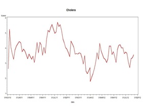
Figure 15: Log Transform of the Cazale Data Set.
When a model with a fundamental frequency of 1 cycle per year and 5 harmonics plus a trend is fit (as per the EEMD decomposition), the picture in figure 16 below emerges where the thick red line is the trend plus a sinusoids part and the black line includes the adjustment for autocorrelation (1 lagged residual is helpful in predicting the next residual). Interestingly only the fundamental cycle is statistically significant.
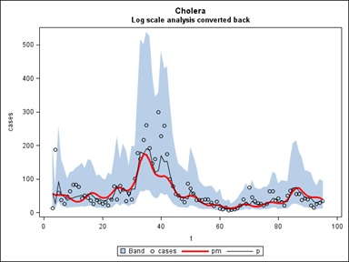
Figure 16: The Log Scale decomposition of the Cazale Data Set, converted back (Figure 15), and with the 5 EEMD IMFs included in blue.
If we then refit the Cazale Data with only the fundamental frequency of 1 cycle per year we get the simpler picture shown in figure 17. The equation of the red curve is the weekly case count = exp (4.5864-0.0158t-0.1174S-0.7522C) where S and C are the sine and cosine of 2πt/52, t is time counted in weeks through the data set and exp is exponentiation. The two years end at weeks t=10 and t=62 as marked by the vertical lines. As in our last statistical report above, when the trend line is lower (the right side) the effect of a multiplicative sinusoid will be less than when it is higher (the left side). This is reflected in the amplitude of the waves when transformed back to the original scale. The linear decrease -0.0158 per week or approximately a 1.58% decrease week to week is statistically significant even after accounting for autocorrelation. You can take the derivative of -0.1174S-0.7522C with respect to t and find out the points t where the local maxima are.
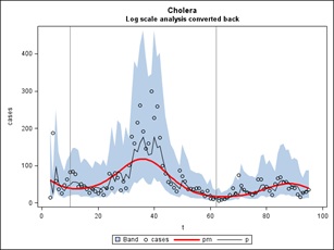
Figure 17: Cholera.
The implications of the above analysis for a projected “Outlook” are provided below.
Projected outlook for future cholera outbreaks at the original 7 stations
Using the log scale (log(Y+1)) model with 1 fundamental and 5 harmonics plus a linear trend, we generated predictions and prediction intervals on the log scale. These can be converted back to the original scale by exponentiation. In the graphs below, in figures 18a-f) predictions were extended 52 weeks past the end of the data (red line) and it is fairly obvious where the peaks are but we are also providing the 52 predictions for each site of the exact week as might be required. A 95% confidence band is shown around each prediction. This is a band for individual observations and thus takes into account both the inaccuracy in estimating the curve and the variation of data around that curve. Black lines delineating the years are included in each graph.
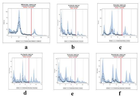 Figure 18: Statistically predicted cases of Cholera by Station Location
PREDICTED CASES
Predicted Cases:
|
Obs |
t |
year |
week |
lead |
pSt Michel |
PGros morne |
PTerr Neuve |
pEnnery |
PAnse Rouge |
P Govaives |
p Marmelade |
|
79 |
68 |
3 |
16 |
1 |
2.3853 |
0.04114 |
-0.05317 |
1.2811 |
0.1799 |
0.24273 |
0.5534 |
|
80 |
69 |
3 |
17 |
2 |
2.9606 |
-0.12607 |
0.08452 |
1.8709 |
0.10291 |
0.30884 |
0.61572 |
|
81 |
70 |
3 |
18 |
3 |
3.5791 |
-0.28437 |
0.29493 |
2.8259 |
0.0259 |
0.42123 |
0.68138 |
|
82 |
71 |
3 |
19 |
4 |
4.2203 |
-0.40575 |
0.47395 |
4.1327 |
-0.04901 |
0.54712 |
0.73885 |
|
83 |
72 |
3 |
20 |
5 |
4.959 |
-0.46575 |
0.48175 |
5.5643 |
-0.11122 |
0.66683 |
0.75013 |
|
84 |
73 |
3 |
21 |
6 |
5.9611 |
-0.44219 |
0.28915 |
6.7784 |
-0.13675 |
0.79895 |
0.66805 |
|
85 |
74 |
3 |
22 |
7 |
7.4246 |
-0.29399 |
0.02467 |
7.6675 |
-0.08944 |
1.00565 |
0.47435 |
|
86 |
75 |
3 |
23 |
8 |
9.4625 |
0.07032 |
-0.16907 |
8.5593 |
0.08242 |
1.37782 |
0.20533 |
|
87 |
76 |
3 |
24 |
9 |
11.8905 |
0.80273 |
-0.22653 |
10.0603 |
0.45346 |
2.00735 |
-0.06913 |
|
88 |
77 |
3 |
25 |
10 |
14.0119 |
1.98905 |
-0.11534 |
12.8015 |
1.09313 |
2.91285 |
-0.29197 |
|
89 |
78 |
3 |
26 |
11 |
14.7951 |
3.29512 |
0.21895 |
17.0577 |
1.91657 |
3.88501 |
-0.44115 |
|
90 |
79 |
3 |
27 |
12 |
13.6615 |
3.8965 |
0.81961 |
21.8322 |
2.47764 |
4.41883 |
-0.51853 |
|
91 |
80 |
3 |
28 |
13 |
11.0985 |
3.35628 |
1.5336 |
24.1879 |
2.23405 |
4.0852 |
-0.52941 |
|
92 |
81 |
3 |
29 |
14 |
8.2077 |
2.21383 |
1.89703 |
21.5247 |
1.31202 |
3.06112 |
-0.46703 |
|
93 |
82 |
3 |
30 |
15 |
5.8072 |
1.20025 |
1.59811 |
15.2878 |
0.38579 |
1.94669 |
-0.2991 |
|
94 |
83 |
3 |
31 |
16 |
4.1272 |
0.57444 |
0.93931 |
9.3303 |
-0.1744 |
1.15122 |
0.05262 |
|
95 |
84 |
3 |
32 |
17 |
3.0435 |
0.27486 |
0.3878 |
5.6011 |
-0.4046 |
0.74071 |
0.74262 |
|
96 |
85 |
3 |
33 |
18 |
2.3422 |
0.18354 |
0.11972 |
3.884 |
-0.39685 |
0.63974 |
2.01221 |
|
97 |
86 |
3 |
34 |
19 |
1.8398 |
0.19889 |
0.13846 |
3.5175 |
-0.10931 |
0.75984 |
4.06315 |
|
98 |
87 |
3 |
35 |
20 |
1.4176 |
0.22214 |
0.47488 |
4.0947 |
0.73836 |
0.97913 |
6.637 |
|
Obs |
t |
year |
week |
lead |
pSt Michel |
PGros morne |
PTerr Neuve |
pEnnery |
PAnse Rouge |
P Govaives |
p Marmelade |
|
99 |
88 |
3 |
36 |
21 |
1.0286 |
0.17051 |
1.21692 |
5.198 |
2.65714 |
1.09312 |
8.5957 |
|
100 |
89 |
3 |
37 |
22 |
0.6812 |
0.03139 |
2.30739 |
5.8552 |
5.54355 |
0.91776 |
8.57181 |
|
101 |
90 |
3 |
38 |
23 |
0.4028 |
-0.13189 |
3.21756 |
4.9593 |
7.29712 |
0.49919 |
6.56189 |
|
102 |
91 |
3 |
39 |
24 |
0.2103 |
-0.24553 |
3.25057 |
2.8609 |
6.01788 |
0.06511 |
3.98989 |
|
103 |
92 |
3 |
40 |
25 |
0.102 |
-0.26666 |
2.46524 |
0.9981 |
3.29385 |
-0.22641 |
2.04714 |
|
104 |
93 |
3 |
41 |
26 |
0.0634 |
-0.16878 |
1.54764 |
-0.0202 |
1.29133 |
-0.35055 |
0.95704 |
|
105 |
94 |
3 |
42 |
27 |
0.072 |
0.07764 |
0.94423 |
-0.4397 |
0.32622 |
-0.32086 |
0.48719 |
|
106 |
95 |
3 |
43 |
28 |
0.0998 |
0.48115 |
0.7152 |
-0.5595 |
-0.01692 |
-0.12142 |
0.4369 |
|
107 |
96 |
3 |
44 |
29 |
0.1185 |
0.94716 |
0.80008 |
-0.4954 |
-0.01159 |
0.28871 |
0.77102 |
|
108 |
97 |
3 |
45 |
30 |
0.1094 |
1.24023 |
1.12252 |
-0.2121 |
0.26818 |
0.87756 |
1.60687 |
|
109 |
98 |
3 |
46 |
31 |
0.0718 |
1.16529 |
1.51933 |
0.427 |
0.80244 |
1.39962 |
3.09397 |
|
110 |
99 |
3 |
47 |
32 |
0.0188 |
0.79263 |
1.70405 |
1.4746 |
1.42672 |
1.51323 |
5.07224 |
|
111 |
100 |
3 |
48 |
33 |
-0.0341 |
0.35859 |
1.48522 |
2.5332 |
1.77763 |
1.17968 |
6.75592 |
|
112 |
101 |
3 |
49 |
34 |
-0.079 |
0.02367 |
0.99515 |
2.8961 |
1.63583 |
0.69136 |
7.22045 |
|
113 |
102 |
3 |
50 |
35 |
-0.1173 |
-0.18167 |
0.51457 |
2.4177 |
1.18612 |
0.30574 |
6.38979 |
|
114 |
103 |
3 |
51 |
36 |
-0.156 |
-0.28761 |
0.19794 |
1.6133 |
0.73908 |
0.09557 |
4.99985 |
|
115 |
104 |
3 |
52 |
37 |
-0.1998 |
-0.33399 |
0.05701 |
0.9306 |
0.44316 |
0.03658 |
3.73372 |
|
116 |
105 |
4 |
1 |
38 |
-0.2468 |
-0.35574 |
0.05255 |
0.4776 |
0.29781 |
0.08169 |
2.82929 |
|
117 |
106 |
4 |
2 |
39 |
-0.2876 |
-0.37805 |
0.13327 |
0.1924 |
0.24376 |
0.17 |
2.23115 |
|
118 |
107 |
4 |
3 |
40 |
-0.3107 |
-0.41064 |
0.23219 |
-0.0097 |
0.20555 |
0.22589 |
1.79419 |
|
119 |
108 |
4 |
4 |
41 |
-0.3076 |
-0.44746 |
0.27993 |
-0.1834 |
0.12062 |
0.19356 |
1.3907 |
|
120 |
109 |
4 |
5 |
42 |
-0.2768 |
-0.47582 |
0.25061 |
-0.3425 |
-0.02406 |
0.07908 |
0.9652 |
|
121 |
110 |
4 |
6 |
43 |
-0.2263 |
-0.48669 |
0.18075 |
-0.4741 |
-0.18888 |
-0.06366 |
0.54364 |
|
122 |
111 |
4 |
7 |
44 |
-0.1761 |
-0.4794 |
0.12975 |
-0.5639 |
-0.3243 |
-0.18501 |
0.18599 |
|
123 |
112 |
4 |
8 |
45 |
-0.1526 |
-0.46221 |
0.13585 |
-0.6081 |
-0.40493 |
-0.26635 |
-0.07013 |
|
124 |
113 |
4 |
9 |
46 |
-0.1726 |
-0.4498 |
0.2013 |
-0.6107 |
-0.42856 |
-0.31481 |
-0.22341 |
|
125 |
114 |
4 |
10 |
47 |
-0.2301 |
-0.45607 |
0.28957 |
-0.5791 |
-0.40449 |
-0.3498 |
-0.29146 |
|
126 |
115 |
4 |
11 |
48 |
-0.299 |
-0.48523 |
0.33492 |
-0.5257 |
-0.3498 |
-0.39052 |
-0.29484 |
|
127 |
116 |
4 |
12 |
49 |
-0.351 |
-0.52978 |
0.28737 |
-0.4677 |
-0.28991 |
-0.44443 |
-0.25336 |
|
128 |
117 |
4 |
13 |
50 |
-0.3671 |
-0.57831 |
0.16415 |
-0.4193 |
-0.25162 |
-0.50357 |
-0.18826 |
|
129 |
118 |
4 |
14 |
51 |
-0.33823 |
-0.62405 |
0.03663 |
-0.37719 |
-0.24858 |
-0.55275 |
-0.12086 |
|
130 |
119 |
4 |
15 |
52 |
-.26237 |
-0.66724 |
-0.02757 |
-0.31804 |
-0.27511 |
-0.58019 |
-0.06513 |
From the above we reach the following summary of the prognostic forecast for Station and Numbers of Cases by Week(s) and Number (od cases).
- Michel: In Week (W) 79 the forecast is for 2 cases rising by 1 case/wk to 10 at W 86 and to 15 by W 89 the receding to 11 in W 91 and down to 2 by Ws 97-99 and no cases after that.
- Gros-Morne: By W 87 there could be 1 case increasing to 4 cases by W 90 dropping to 1 case by W 93 and staying at zero until 1 case occurs in W 108, dropping back to zero thereafter.
- Terr-Neuve: Cases 1-2 occurs by Ws 90-92, increasing to 3 by W 102 and decreasing to zero thereafter.
- Ennery: Begins with 1 case increasing to 10 cases by W 87, and then rising to 24 by W 91, dropping to 4 cases by Ws 96-98, rising to 6 cases by W 100 dropping to zero by W 104 and thereafter.
- Anse-Rouge: No cases until W 88 with 1, then 2-3 by Ws 90-92, are dropping to zero then rising from 1 in W 98 to 7 by W 101, dropping to 1 to 2 cases by W 115 and then dropping to zero thereafter.
- Govaives: 1 case in W 85, rising to 4-5 by Ws 89-90dropping to 1 by W 94 and then zero until Ws 108-109, with 2 cases by W 111 and then zero thereafter.
- Marmalade: Could be 1 case during period from Ws 79-85, then 2 in W 96, rising to 9 in W 99 dropping to 1 by W 104, rising to 7 by W 112, dropping to 1 by W 120, and zero thereafter.
Here we conclude this prognostic-forecast discussion by pointing out that: We need to be sure to put in some heavy caveats about predicting-forecasting a repeating pattern having only seen it once (more or less). Also we note, for your reading pleasure, that by using six frequencies in this Fourier analysis for all sites, we are leaving in all frequencies that are significant in at least one of the sites but if we went site by site we almost certainly would not need them all. This way we have some consistency but risk that some of the wiggling we see is just noise rather than true signal. There was at least one site where the fifth harmonic was statistically significant, in other words. For some of these it is easily possible to run a horizontal line completely through the confidence bands so from a practical point of view the seasonality and trend are not dramatic at all. And finally, because this is a periodic model, the peaks are forced to occur in the same week every year, as the model has no ability to do anything else.
Statistical analyses of multi-disease data sets.
In the Boxes shown in figure 19, we present the various disease and or medical condition data sets provided to us for possible analyses. The data were collected at the 7 Public Health facilities in Haiti. While we are not in a position to develop causal relations, thus attribution of a medical condition to the outbreak and spread of cholera.
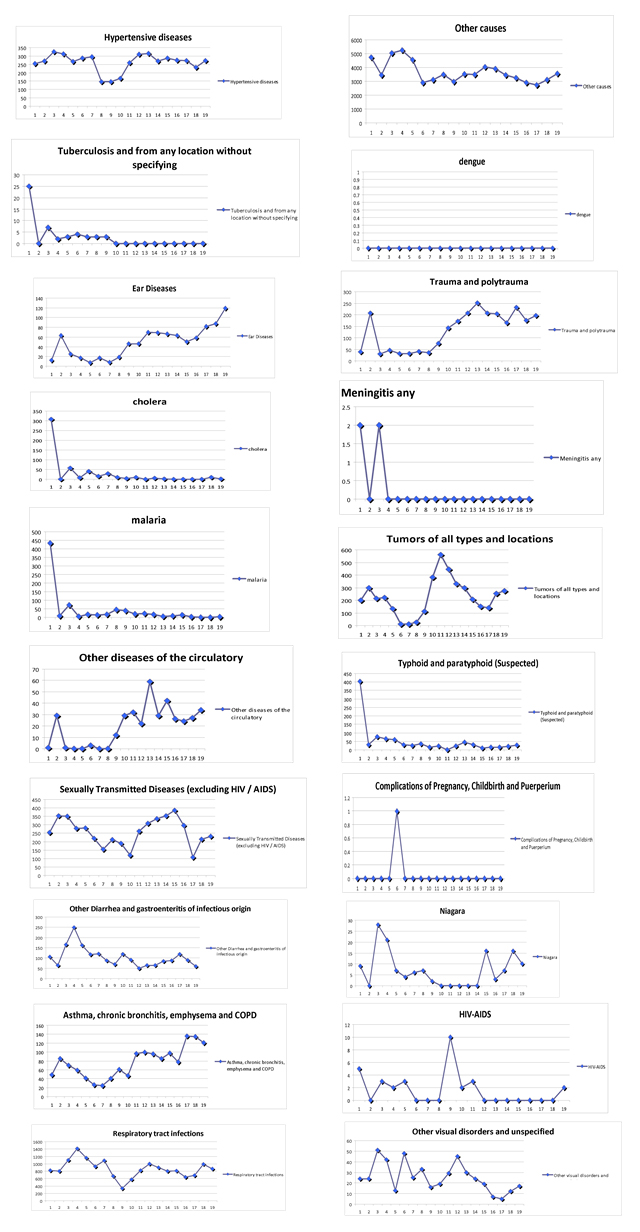
Figure 19: Documented numbers of diseases and medical conditions at the 7 Public Health Stations in Haiti.
Next we present our Statistical Analyses of the above diseases and medical conditions. First, we eliminate all diseases with 0 occurrences. These are: Leprosy, Diphtheria, Dengue, Leishmaniasis, Chagas Disease, Schistosomiasis (Bilharzia), and Onchocerciasis.
Next we label the remaining diseases. They are:
STRING LABEL
String Label
- D1 Cholera
- D2 Typhoid and Paratyphoid (Suspected)
- D3 Other Diarrhea and Gastroenteritis of infectious origin
- D4 Tuberculosis and from any location without specifying
- D5 Meningitis any
- D6 Sexually Transmitted Diseases (excluding HIV / AIDS)
- D7 HIV-AIDS
- D8 Malaria
- D9 Intestinal Parasitism not otherwise specified
- D10 Respiratory Tract infections
- D11 Other Infectious and Parasitic Diseases
- D12 Tumors of all types and locations
- D13 Niagara
- D14 Other visual disorders and unspecified
- D15 Ear Diseases
- D16 Hypertensive diseases
- D17 Other diseases of the circulatory
- D18 Asthma, Chronic Bronchitis, Emphysema and COPD
- D19 Complications of Pregnancy, Childbirth and Puerperium
- D20 Trauma and Polytrauma
- D21 Other causes
Next we ran a correlation matrix on these showing only those with correlations greater than 0.75. Note there is no a priori reason to choose the 75% of probability but this is a very strong %. In any case, omitting correlations less than 0.75, we get:
|
Variable |
D1 |
D2 |
D3 |
D4 |
D5 |
D6 |
D8 |
D9 |
D10 |
D11 |
D13 |
D15 |
D16 |
D17 |
D18 |
D20 |
D21 |
|
D1 |
. |
99 |
. |
98 |
79 |
. |
98 |
. |
. |
. |
. |
. |
. |
. |
. |
. |
. |
|
D2 |
99 |
. |
. |
96 |
76 |
. |
97 |
. |
. |
. |
. |
. |
. |
. |
. |
. |
. |
|
D3 |
. |
. |
. |
. |
. |
. |
. |
. |
. |
. |
. |
. |
. |
. |
. |
. |
. |
|
D4 |
98 |
96 |
. |
. |
82 |
. |
97 |
. |
. |
. |
. |
. |
. |
. |
. |
. |
. |
|
D5 |
79 |
76 |
. |
82 |
. |
. |
77 |
. |
. |
. |
. |
. |
. |
. |
. |
. |
. |
|
D6 |
. |
. |
. |
. |
. |
. |
. |
. |
. |
. |
. |
. |
. |
. |
. |
. |
. |
|
D7 |
. |
. |
. |
. |
. |
. |
. |
. |
. |
. |
. |
. |
. |
. |
. |
. |
. |
|
D8 |
98 |
97 |
. |
97 |
77 |
. |
. |
. |
. |
. |
. |
. |
. |
. |
. |
. |
. |
|
D9 |
. |
. |
. |
. |
. |
. |
. |
. |
. |
. |
. |
. |
. |
. |
. |
. |
. |
|
D10 |
. |
. |
. |
. |
. |
. |
. |
. |
. |
. |
76 |
. |
. |
. |
. |
. |
. |
|
D11 |
. |
. |
. |
. |
. |
. |
. |
. |
. |
76 |
. |
. |
. |
. |
. |
. |
. |
|
D12 |
. |
. |
. |
. |
. |
. |
. |
. |
. |
. |
. |
. |
. |
. |
. |
. |
. |
|
D13 |
. |
. |
. |
. |
. |
. |
. |
. |
. |
. |
. |
. |
. |
. |
. |
. |
. |
|
D14 |
. |
. |
. |
. |
. |
. |
. |
. |
. |
. |
. |
. |
. |
. |
. |
. |
. |
|
D15 |
. |
. |
. |
. |
. |
. |
. |
. |
. |
. |
. |
. |
. |
75 |
89 |
85 |
. |
|
D16 |
. |
. |
. |
. |
. |
. |
. |
. |
. |
. |
. |
. |
. |
. |
. |
. |
. |
|
D17 |
. |
. |
. |
. |
. |
. |
. |
. |
. |
. |
. |
75 |
. |
. |
. |
91 |
. |
|
D18 |
. |
. |
. |
. |
. |
. |
. |
. |
. |
. |
. |
89 |
. |
. |
. |
81 |
. |
|
D19 |
. |
. |
. |
. |
. |
. |
. |
. |
. |
. |
. |
. |
. |
. |
. |
. |
. |
|
D20 |
. |
. |
. |
. |
. |
. |
. |
. |
. |
. |
. |
85 |
. |
91 |
81 |
. |
. |
|
D21 |
. |
. |
. |
. |
. |
. |
. |
. |
. |
. |
. |
. |
. |
. |
. |
. |
. |
Now here we note that there are 99% correlation relationships which are highly unlikely. So revisiting the data sets we note some apparent singularities at the onset of the data time series. So we will eliminate those and redo the Correlation Matrix. We next take away the first observations and a very different story emerges:
|
Variable |
D1 |
D2 |
D3 |
D4 |
D5 |
D6 |
D8 |
D9 |
D10 |
D11 |
D13 |
D15 |
D16 |
D17 |
D18 |
D20 |
D21 |
|
D1 |
. |
. |
. |
83 |
. |
. |
. |
. |
. |
. |
. |
. |
. |
. |
. |
. |
. |
|
D2 |
. |
. |
. |
. |
. |
. |
. |
. |
. |
. |
. |
. |
. |
. |
. |
. |
84 |
|
D3 |
. |
. |
. |
. |
. |
. |
. |
. |
. |
. |
. |
. |
. |
. |
. |
. |
. |
|
D4 |
83 |
. |
. |
. |
. |
. |
78 |
. |
. |
. |
. |
. |
. |
8 |
. |
9 |
. |
|
D5 |
. |
. |
. |
. |
. |
. |
. |
. |
. |
. |
. |
. |
. |
. |
. |
. |
. |
|
D6 |
. |
. |
. |
. |
. |
. |
. |
. |
. |
. |
. |
. |
. |
. |
. |
. |
. |
|
D8 |
. |
. |
. |
78 |
. |
. |
. |
. |
. |
. |
. |
. |
. |
. |
. |
. |
. |
|
D9 |
. |
. |
. |
. |
. |
. |
. |
. |
. |
. |
. |
. |
. |
. |
. |
. |
. |
|
D10 |
. |
. |
. |
. |
. |
. |
. |
. |
. |
76 |
. |
. |
. |
. |
. |
. |
. |
|
D11 |
. |
. |
. |
. |
. |
. |
. |
. |
76 |
. |
. |
. |
. |
. |
. |
. |
. |
|
D12 |
. |
. |
. |
. |
. |
. |
. |
. |
. |
. |
. |
. |
. |
. |
. |
. |
. |
|
D13 |
. |
. |
. |
. |
. |
. |
. |
. |
. |
. |
. |
. |
. |
. |
. |
. |
. |
|
D14 |
. |
. |
. |
. |
. |
. |
. |
. |
. |
. |
. |
. |
. |
. |
. |
. |
. |
|
D15 |
. |
. |
. |
. |
. |
. |
. |
. |
. |
. |
. |
. |
. |
. |
89 |
84 |
. |
|
D16 |
. |
. |
. |
. |
. |
. |
. |
. |
. |
. |
. |
. |
. |
. |
. |
. |
. |
|
D17 |
. |
. |
. |
8 |
. |
. |
. |
. |
. |
. |
. |
. |
. |
. |
. |
91 |
. |
|
D18 |
. |
. |
. |
. |
. |
. |
. |
. |
. |
. |
. |
89 |
. |
. |
. |
81 |
. |
|
D20 |
. |
. |
. |
9 |
. |
. |
. |
. |
. |
. |
. |
84 |
. |
91 |
81 |
. |
. |
|
D21 |
. |
84 |
. |
. |
. |
. |
. |
. |
. |
. |
. |
. |
. |
. |
. |
. |
. |
Next, eliminating variables that have no correlations exceeding 0.75 with others we get:
|
Variable |
(D1 |
D4 |
D8) |
(D10 |
D11) |
(D17 |
D20 |
D15 |
D18) |
(D2 |
D21) |
|
D1 |
. |
83 |
. |
. |
. |
. |
. |
. |
. |
. |
. |
|
D4 |
83 |
. |
78 |
. |
. |
8 |
9 |
. |
. |
. |
. |
|
D8 |
. |
78 |
. |
. |
. |
. |
. |
. |
. |
. |
. |
|
D10 |
. |
. |
. |
. |
76 |
. |
. |
. |
. |
. |
. |
|
D11 |
. |
. |
. |
76 |
. |
. |
. |
. |
. |
. |
. |
|
D17 |
. |
8 |
. |
. |
. |
. |
91 |
. |
. |
. |
. |
|
D20 |
. |
9 |
. |
. |
. |
91 |
. |
84 |
81 |
. |
. |
|
D15 |
. |
. |
. |
. |
. |
. |
84 |
. |
89 |
. |
. |
|
D18 |
. |
. |
. |
. |
. |
. |
81 |
89 |
. |
. |
. |
|
D2 |
. |
. |
. |
. |
. |
. |
. |
. |
. |
. |
84 |
|
D21 |
. |
. |
. |
|
.. |
. |
. |
. |
. |
84 |
. |
- D1 cholera
- D2 Typhoid and paratyphoid (Suspected)
- D3 Other Diarrhea and gastroenteritis of infectious origin
- D4 Tuberculosis and from any location without specifying
- D5 Meningitis any
- D6 Sexually Transmitted Diseases (excluding HIV / AIDS)
- D7 HIV-AIDS
- D8 malaria
- D9 Intestinal Parasitism not otherwise specified
- D10 Respiratory tract infections
- D11 Other Infectious and Parasitic Diseases
- D12 Tumors of all types and locations
- D13 Niagara
- D14 Other visual disorders and unspecified
- D15 Ear Diseases
- D16 Hypertensive diseases
- D17 Other diseases of the circulatory
- D18 Asthma, chronic bronchitis, emphysema and COPD
- D19 Complications of Pregnancy, Childbirth and Puerperium
- D20 Trauma and polytrauma
- D21 Other causes
These are remarkable groupings. They do not indicate “causality” but they do indicate very, very highly correlated relationships which are either medical in nature or socio-economic or other.
Here we see the clustering of:
- D1, D4 and D8 (Red) with strong Positive Correlations.
- D10 and D11 (Green) with strong Positive Correlations.
- D15, D17, D18 and D20 (Purple) with strong Positive Correlations.
- D2 and D21 with strong Positive Correlations.
- D17 and D20 with strong Negative Correlations.
Basically strong Positive Correlations imply that: if you know one disease or medical condition is present and increasing (or decreasing) then the other disease or medical condition will also be present and be increasing (or decreasing). Alternatively, strong Negative Correlations imply that: if you know one disease or medical condition is present and increasing (or decreasing) then the other disease or medical condition will also be present and be decreasing (or increasing). Again, this does not prove “causality” but it does show powerful correlative connectivity. To wit, if you know one, then you know the other.
SUMMARY
Basically the empirical and statistical analyses show highly complementary and revealing results. Moreover, both suggest that the downward trends indicate that these two principal peaks were related but singular events; likely related to the circumstances following the Earthquake and a combination of environmental and socio-economic factors. Without further evidence we see no compelling evidence for a cholera breakout of any significant magnitude this coming year. However, in a section above (and summarized below), we have extended our diagnostic analysis into the next period and presented our prognostic analysis; with appropriate caveats.
More advanced analyses would incorporate a consideration of environmental factors such as precipitation, water and air temperatures, locale, etc., and oceanic, hydrologic and atmospheric long term factors such as atmospheric temperatures, precipitation, water quality, various climate factors, along with public health variables such as hospital size, road access, dedicated medical teams, especially potable water, infra-structure, etc. The environmental factors could be coupled to socio-economic factors and then decomposed both statistically and empirically, with the cross correlations occurring utilizing intrinsic mode functions. A more revealing retrospective, diagnostic analysis would result and it is possible and highly likely that a prognostic capability could be created; one more sophisticated than that which we presented above and summarized below.
EMPIRICAL ANALYSES
- In the empirical analysis, there are 6 intrinsic modes of variability.
- The 6th is the overall trends at the 7 original stations. Mode 6 represents the long-term or record length trends of the various time series. All trends, if well correlated, are positive, meaning that time series varied either in an ascending or decreasing sense as time progressed. The maximum correlation coefficient is between Govaives and Gros Morne, with the second largest between Govaives and Marmalade. Anse rouge displays an extremely significant correlation with all other stations, while Ennery is only significantly connected to Anse rouge and St Michel, and is independent of the other stations.
- Mode 5 displays 1.5 year variability and all stations, except for Anse rouge and Terrneuve, are strongly correlated. The highest correlation occurs between Gros Morne and Govaives, second highest correlation between Marmalade and Ennery. We note that, excepting for St. Michel and Anse rouge all stations are either strongly positively or negatively correlated over the year and a half time scale; so if you know one you know the other.
- Mode 4 shows 40-50 weeks of variability. Ennery, Gros Morne and Terrneuve are all significantly correlated to other stations. The highest correlation is between Gros Morne and Govaives (0.9760) with the second highest between Ennery and St Michel. Notably, the overall strong positive correlations between stations implies that Mode 4 of the time series in those stations are in-phase, and have similar variation patterns.
- Mode 3 shows 15-20 weeks in variability. The strongest correlation occurs between Govaives and Ennery and Gros Morne. Ennery and Govaives are significantly correlated to all other stations, except to Anse rouge, which is correlated with Marmalade and Terrneuve.
- Mode 2 depicts about 7 - 8 weeks in variability. Govaives has a very strong correlation with Gros Morne and to a lessor degree, Terrnruve, however it has no significant correlation with Marmalade. Govaives is significantly correlated to Anse rouge and St Michel. Anse rouge and Ennery are also significantly correlated. Terrneuve is significantly correlated with all other stations except for St Michel, which itself is well correlated with all stations but Marmalade and Terreneuve.
- Mode1 is the mode that represents the highest frequency of variability, ~ 2-3 weeks, of the time series at each station. For Mode 1, Govaives has the highest positive correlation with Gros Morne, followed with a second strong negative correlation (-0.6060) between stations Gros Morne, Marmalade and Terreuve. The above correlations of the first EEMD mode indicates that Govaives, Gros Morne, Marmalade and Terrnruve are most strongly connected, while station St Michel is only statistically correlated with station Ennery and is independent of other stations. Anse rouge has a very statistically significant correlation with Terrneuve, but has no significant correlation with other stations. Although Ennery, Marmelade and St Michel are connected, their correlations are not extremely significant.
If we had summed over all 7 stations and then smoothed the data, followed by an empirical decomposition we find that: There are 4 principal peaks:
- The 1st peak is from S42 to S62 centered about S49 at a peak level of 200 cases
- The 2nd peak is from S18 to S32 centered at S27 at a peak level of 180 cases
- The 3rd and 4th peaks are at ~S38 and S46 @ about 60 and 40 cases, respectively
- The events are essentially gone after S60
- The decreasing period in the above plots could be interpreted as less persistent periods. Therefore, even though we have two peaks, their significance is different. By the second peak the period of persistent is reduced to around 10 weeks.
The Cazale Data Set: The Cazale data was compiled daily. This is in contrast to the previous data sets presented above which were compiled over a week’s period of time for each locale. The empirical decomposition indicates that the increase in the frequency of sampling added three higher frequencies Intrinsic Mode Functions, to the suite of modes; so 9 versus 6 of the original 7 stations. This offered us the opportunity of doing weekly averages over the data set, which we then compared and contrasted with the original 7 station time series already discussed above. We also presented the weekly averaged time series decomposition and sure enough the three very high frequency modes disappeared. Basically, in the 9 mode decomposition Modes 1 and 2 indicated “noise” in the data. Mode 3 was 2-3 day variability which could not be revealed in the weekly sampling of the original 7 stations. Mode 5 was bi-weekly to monthly variability. Mode 6 shows monthly to seasonal variability. Mode 7 is nearly annual variability. Mode 8 is inter-annual variability. Mode 9 is the record length trend.
STATISTICAL ANALYSES OF THE ORIGINAL 7 STATIONS
Diagnostic Analysis
All series have seasonal patterns; which is not to say that they are all coherent with each other; rather they share similar frequencies of variability. However, a record length cross-correlation matrix and scatter plots showed that: St. Michel is highly correlated with Gros-morne, Ennery and Govaives; Gros-morne is highly correlated with St. Michel and Govaives; Terr-Neuve is highly correlated with Anse-Rouge; Ennery is highly correlated with St Michel and Govaives; Anse-Rouge is highly correlated with Terre-neuve and Marmalade; Govaives is highly correlated with Gros-morne and Ennery; and Marmelade is highly correlated with Anse-Rouge.
The Scatter plots show the above relationships in a highly visual way; with ellipses that if tilted from left to right upward and narrow(er) indicate the degree of higher correlation (basically a circle does not indicate high correlations).
We computed the mean of the 7 sites for each week then regressed on the 7 data sets and produced a downward trend.
Here we produced diagnostic predictions of the data, based on the data, and found diagnostically predicted peaks at t=-6 weeks, repeating 52 weeks later at week t=46. So, we found it at week 46 of 2 years of data. Between these markers was a larger peak at t=27 weeks. There was no week 27 value in either of the other years. Note that t=1 is the first week of the middle year with negative t’s for the previous year.
A statistically significant downward trend was found. The trend shows about a 3% drop in rate per week.
From the statistical perspective, claims of significant seasonality based on less than 2 years of data is on very shaky ground. If forced to do so, it would appear that there is a bimodal pattern peaking around weeks 27 and 46 of the year but notice that the only case where we saw more than one instance of the peak was the leftmost and rightmost lines (at week 46). The week 27 peak is based on only one of the observed years. Note that on the original scale our effects are multiplicative so when the level is lower, like in that second instance, the multiplicative increase will produce a less impressive peak than that at the higher level. A 5% increase when the rate is 100 cases per million people is just 5 people whereas it is 50 people when the rate is 1000 cases per million people. That is why the second instance is a lower peak than the first. It is a percentage increase from a lower point on that linear trend.
By taking a mean over the 7 cases, we are ignoring any phase alignment issues but we think there was reasonable coherency shown in our analysis. Also, there was no accounting for autocorrelation when computing the prediction bands or t tests. Autocorrelation could render bands a little wider and tests less significant (more uncertainty). On the positive side we are explaining about 90% of the variation on the log scale with this model as the R2 plots show.
Statistically speaking, the patterns are intriguing, but we have so few years to go on that we are hesitant to think we've pinned down the pattern. We do get a nice fit, explaining 90% of the variation in the historic weekly mean incidence with our model. The question is whether that will hold up in future years. We've not seen enough years to feel confident about repetitive behavior. The rate does seem to be trending downward recently, which is great. However the model results could be extended into another year as we did do and summarize the results of below
Statistical analyses of the multi-disease data sets
- Cholera, Tuberculosis and Malaria are highly positively correlated.
- Respiratory Tract Infections and Other Infectious & Parasitic Diseases are highly positively correlated
- Typhoid & Paratyphoid and Other Causes are highly positively correlated.
- Ear Diseases, Asthma, Chronic Bronchitis, Emphysema, COPD, Trauma, Polytrauma and Other Diseases of the Circulatory are highly correlated.
- With Trauma & Polytrauma and Other Diseases of the Circulatory having a high negative correlation.
Projected outlook for a future cholera outbreak
- Michel, in Week (W) 79 the forecast is for 2 cases rising by 1 case/wk to 10 at W 86 and to 15 by W 89 the receding to 11 in W 91 and down to 2 by Ws 97-99 and no cases after that.
- Gros-Morne, by W 87 there could be 1 case increasing to 4 cases by W 90 dropping to 1 case by W 93 and staying at zero until 1 case occurs in W 108, dropping back to zero thereafter.
- Terr-Neuve, 1-2 cases occur by Ws 90-92, increasing to 3 by W 102 and decreasing to zero thereafter.
- Ennery, cases begin with 1 case increasing to 10 cases by W 87, and then rising to 24 by W 91, dropping to 4 cases by Ws 96-98, rising to 6 cases by W 100 dropping to zero by W 104 and thereafter.
- Anse-Rouge there are no cases until W 88 with 1, then 2-3 by Ws 90-92, dropping to zero then rising from 1 in W 98 to 7 by W 101, dropping to 1 to 2 cases by W 115 and then dropping to zero thereafter.
- Govaives there is 1 case in W 85, rising to 4-5 by Ws 89-90 dropping to 1 by W 94 and then zero until Ws 108-109, with 2 cases by W 111 and then zero thereafter.
- Marmalade, there could be 1 case during period from Ws 79-85, then 2 in W 96, rising to 9 in W 99 dropping to 1 by W 104, rising to 7 by W 112, dropping to 1 by W 120, and zero thereafter.
Post mortems
The Results are presented in figure 20.
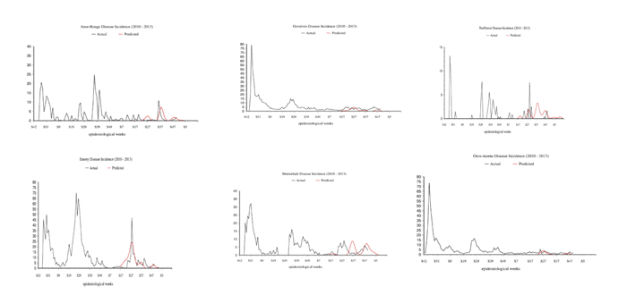
Basically, the forecasts vs. the actual outcomes for:
- Anse-Rouge was outstanding with three peaks in both, and with both the timing and the amplitudes of the 2nd and 3rd peaks right on.
- Govaives was solid with three peaks in both but only okay as the timing and amplitude of the 1st and 3rd peaks are off while that of the 2nd peak was right on.
- Marmelade was solid with three peaks in both and okay as the timing and amplitude of the 1st and 3rd peaks are right on while that of the very broad 2nd peak was off.
- TerrNeuve was off in the timing of the peaks, but the amplitudes of the peaks were solid and the number of peaks, with six predicted and six occurring, was outstanding.
- Ennery was very good as both the timing and amplitudes of the actual and predicted 5th peaks were right on, however while the forecast was for four peaks and there were five actual, the predicted 3rd peak fell between the 3rd and 4th actual peaks, the agreement was not too bad overall. Additionally, considering the relatively high and low numbers of actual and predicted cases, the comparison is very good.
- Gros morne was okay considering the low number of cases.
- Michel shows a mixed outcome as the only one peak was predicted and the timing and amplitude of that peak vs. the actual realization was outstanding, however the forecast missed the 2nd and 3rd peaks entirely.
On the positive side, there is good structure and momentum in the individual and collective time series. As such, the memory in the systems is capable of being carried forward in a probabilistic sense. So, one can conclude that there are individual and distinct signals which can be and have been separated from the noise in each of the time series.
Albeit, one must recognize that the forecasts are totally probabilistic and not deterministic. Moreover and this point cannot be overstated, the time series are very short in all cases, so there are very few data points. Also, there have not been any correlative analyses done with other likely relevant parameters and variables, other than the cross correlations that we conducted between the stations.
The challenge created by the short time series can be briefly summarized with a simple example. To wit, if a faculty member left his/her office to walk across campus and the first two students he saw were wearing NC State tee shirts, then what would he guess, probabilistically speaking, that the next student would be wearing; an NC State tee shirt or not; 50/50?
Again, probabilistically speaking, if we found that using 117 years of hourly temperature data that the coldest two weeks of the year occur during the 2nd and 3rd weeks of January, then what about the forecast for 2013? What are the odds that it would necessarily be those two weeks or could it end up being the 4th week of January and the 1st week of February, etcetera? As such, probabilistic forecasts are not deterministic.
In terms of the timing and amplitude, while we have several observations, they cover only a bit over 1 year so we have had only one look at a pattern that is not necessarily going to repeat the next year.
In our forecasts we did not account for any of the external variables that the different regional facilities are located in, such as: Relationships to weather and climate factors, with the former and latter including such conditions as warm and humid conditions, altitude, arid versus no-arid conditions, thus low or high low precipitation, transportation availability, water contamination, the ability of the stricken to get to the hospitals, the exposure of the populace to disease carrying hosts, such as outsiders carrying the disease into the locale(s), polluted water, and so on.
So the solution to the improvement of forecasts would be to have longer time series at individual and multiple locations which document incidence and also to be able to conduct correlative analyses with other factors that may be conditional and or causal in nature. We actually showed the power of such studies and analyses with our cross-correlations between station-to-station cholera data and also our cross-correlation study of the other diseases and medical conditions. These powerful relationships or lacks therein, were in the report as well.
All of that said, the results are very encouraging, especially given the paucity of data, suggesting that highly reliable relationships can be created given appropriate data sets, and sufficient time and effort. This study demonstrates that empirical and statistical mathematics can be utilized to decompose and analyze data that are not common to the medical community. As such, we have demonstrated that new and novel mathematical approaches can be very revealing about the causes of diseases, let alone on how one can create prognostic capabilities.
ACKNOWLEDGEMENT
REFERENCES
- Wu Z, Huang NE, Long SR, Peng CK (2007) On the trend, detrending and variability of nonlinear and non-stationary time series. Proc Nat Acad Sci USA 104: 14889-14894.
- Gabor L (1946) Radio and communication engineering. Journal of the Institution of Electrical Engineers-Part III 26: 429-441.
- Huang NE, Shen Z, Long SR (1999) A new view of nonlinear water waves: the hilbert spectrum. Annual Review of Fluid Mechanics 31: 417-457.
- Huang NE, Wu ML, Long SR, Shen SS, Qu WD, et al. (2003) A confidence limit for the empirical mode decomposition and hilbert spectral analysis. Proc Roy Soc London 459: 2317-2345.
- Huang NE, Wu Z (2008) A review on Hilbert-Huang Transform: the method and applications on geophysical studies. Rev Geophys 46: 2006.
- Wu Z, Huang NE (2004) A study of the characteristics of white noise using the empirical mode decomposition method. Proc Roy Soc London 460: 1597-1611.
- Wu Z, Huang NE (2009) Ensemble empirical mode decomposition: A noise assisted data analysis method. Advances in Adaptive Data Analysis 1: 1-41.
- Bendat JS, Piersol AG (2010) Random data, analysis and measurement procedures. John Wiley and Sons, New York, USA.
Citation: Pietrafesa LJ, Dickey DA, Henwood TM, Gayes PT, Bao S, et al. (2019) Statistical and Empirical Analyses of Haiti Cholera Post Mortems. J Environ Sci Curr Res 2: 012.
Copyright: © 2019 Pietrafesa LJ, et al. This is an open-access article distributed under the terms of the Creative Commons Attribution License, which permits unrestricted use, distribution, and reproduction in any medium, provided the original author and source are credited.